
What Are The Best Digital Signage Fonts for Eye-Catching Displays?
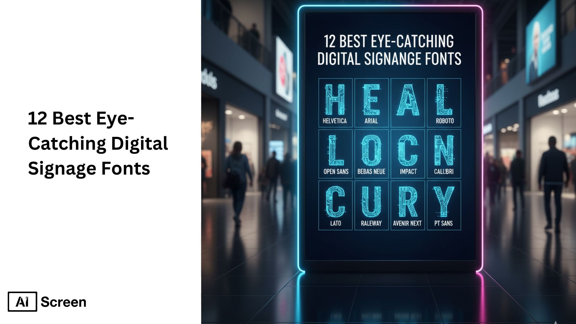
Are you looking for the best eye catching signage fonts to make your screens stand out and grab attention? For impactful displays, it’s important to use fonts that are clear, highly legible, and visually appealing from a distance. Sans-serif choices such as Helvetica, Arial, Futura, and Avenir are trusted for their readability and modern feel. If your goal is to create bold, attention-grabbing headlines, options like Impact or Bebas Neue are ideal. Always ensure your font matches the message and target audience, while considering font size, color contrast, and background for maximum visibility.
This article outlines the 12 best eye catching digital signage fonts for businesses across industries. Each section explains why these fonts work on digital screens, their stylistic benefits, and where they fit best, whether for menus, various advertising materials, or social media graphics. By the end, you’ll have practical guidance for font selection to improve digital signage effectiveness and engage your target audience more effectively. If you are also comparing platforms, our guide to the best digital signage software companies manufacturing kpi dashboards shows how strong typography pairs with data driven displays.
1. Is Helvetica a Good Signage Font?
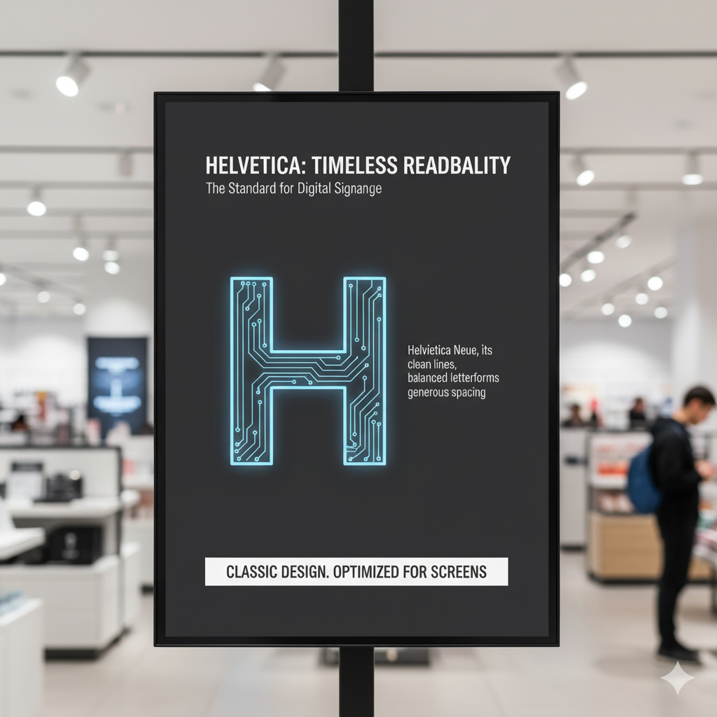
Helvetica is one of the most widely used digital signage fonts because of its timeless design and excellent readability. Its neutral, clean, and versatile look makes it suitable for almost any industry, from retail to healthcare. Businesses often choose Helvetica for digital signage displays because it maintains clarity at both small and large sizes, ensuring the message is clear from a distance. According to Intel, digital signage can reduce perceived wait times in queues by up to 35%.
Let’s take an example: airports rely heavily on Helvetica for flight information boards, where travelers need to read quickly, even from across a large terminal. Similarly, Apple stores often use Helvetica in digital product signage, keeping the brand’s minimalistic and modern identity intact.
2. Is Arial a Reliable Signage Font?
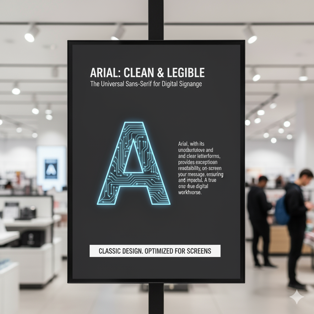
Arial is another classic sans-serif font widely used in digital signage software because of its clean design and easy to read fonts. With its slightly wider spacing and high contrast , Arial is especially effective in high-visibility environments such as shopping malls or schools. It ensures that even from afar, your digital signage content is easy to follow.
Let’s say a quick-service restaurant wants to highlight combo meals on its digital menu boards. Arial makes the text stand out without looking overwhelming. You’ve probably noticed that many corporate offices also use Arial on digital meeting room displays, ensuring schedules and notices are easy to understand.
3. Is Open Sans a Signage Font?
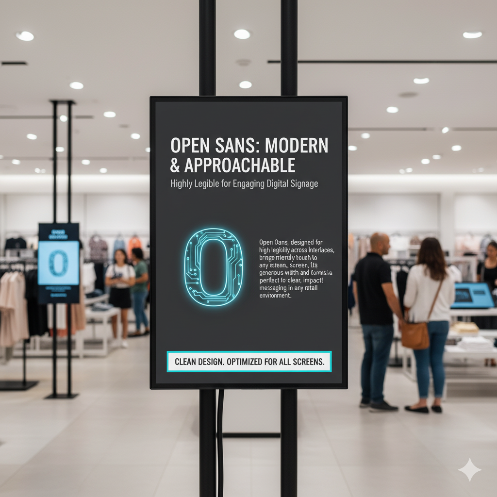
Open Sans stands out in digital signage projects because of its modern, approachable look and highly readable legibility. Its clean lines and well-proportioned spacing make it a popular choice for both retail signage and restaurant digital menu boards. The font gives a welcoming tone, which makes it ideal when connecting with diverse audiences. According to Nielsen, 47% of customers recall specific ads or messages from digital displays even after 30 days.
Let’s take an example from the coffee industry: cafés often use Open Sans on digital screens to highlight seasonal drinks and daily specials, making the menu feel more personal. Clothing retailers, on the other hand, use Open Sans on digital promotional signage, where clarity helps catch attention without distracting from the visuals.
4. Is Roboto a Modern Signage Font?
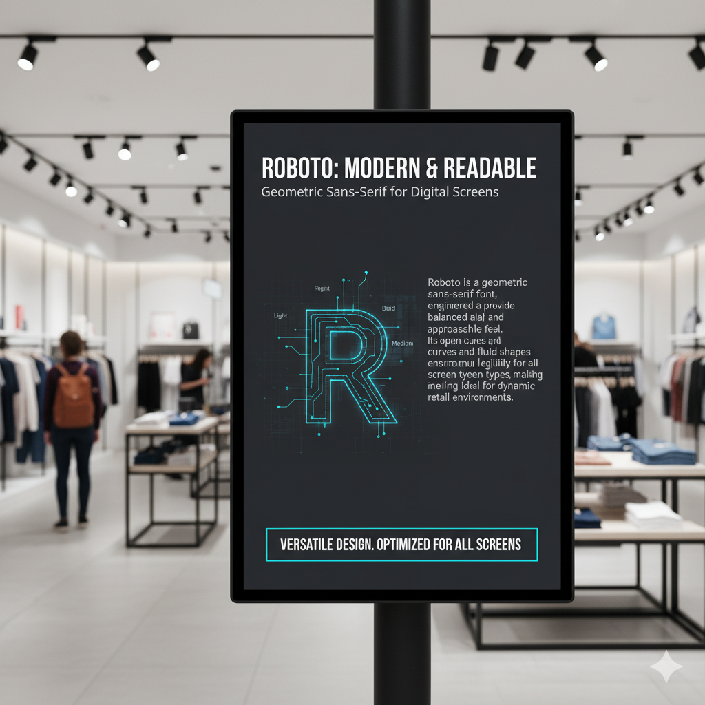
Roboto is a geometric sans-serif font designed to balance modern aesthetics with practical readability. Its mechanical structure and open curves make it highly legible in digital signage displays, giving it a modern appearance, whether it’s used for short headlines or longer informational text. This balance makes it one of the most reliable digital signage fonts available. According to Grand View Research, the global digital signage market is projected to reach $45 billion by 2030, growing at a 7.7% CAGR.
Let’s say a hospital installs wayfinding signage. Roboto works perfectly because it communicates directions clearly while keeping a professional appearance. A good case is also seen in electronics stores, where Roboto is often used on digital advertising materials to maintain a clean and modern look.
5. Is Montserrat a Bold Signage Font?
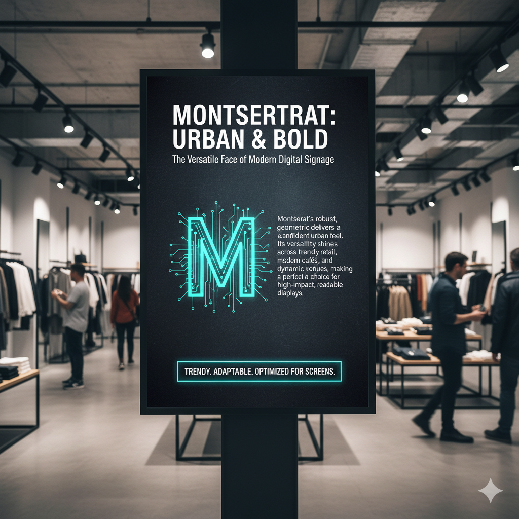
Montserrat brings a bold, urban feel to digital signage solutions, and its font’s versatility makes it perfect for trendy retail outlets, modern cafés, and even entertainment venues. Its distinctive geometric shapes are designed to grab attention instantly, which makes it ideal for businesses that want to create bold fonts in their digital signage.
You’ve probably noticed Montserrat in fashion brand stores, where digital displays showcase bold seasonal promotions with stylish typography. Let’s take an example of a café, using Montserrat on digital menu boards instantly creates a trendy, urban vibe that appeals to younger audiences.
6. Is Lato a Friendly Signage Font?
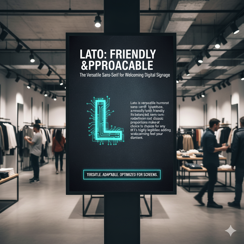
Lato is a versatile sans serif typeface that adds a friendly and approachable tone to digital signage content. Its balance of clean lines and subtle curves makes it easy to read and visually appealing, while still giving a softer, more welcoming personality compared to stricter fonts like Helvetica or Arial.
Let’s say a family-friendly restaurant uses Lato on its digital menu boards. The approachable appearance makes customers feel at ease while ordering. Another good case is in coworking spaces, where digital signage displays using Lato highlight events or community announcements in a way that feels engaging and less corporate.
7. Is Bebas Neue a Signage Font?
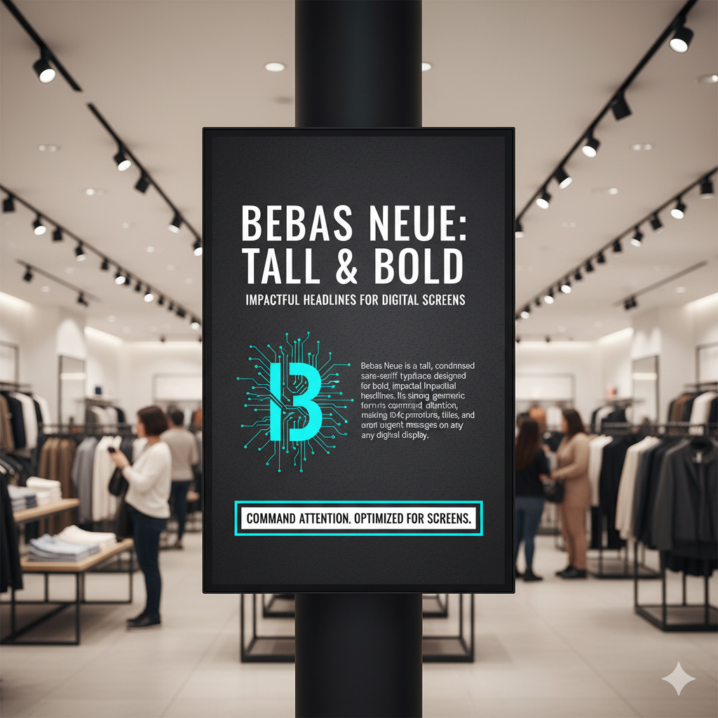
Bebas Neue is a tall, condensed sans serif font that works beautifully for bold headlines in digital signage projects. Its commanding presence makes it a favorite for environments where font clarity matters most, such as gyms, retail promotions, or event signage. The font’s slim yet impactful design allows messages to stand out even from long distances. According to PopAI Research, 60% of businesses reported a significant increase in brand awareness after adopting digital signage that resonates with their target audience.
Let’s take an example of a fitness center, Bebas Neue is often used on digital displays to showcase motivational quotes or class schedules, grabbing attention immediately. You’ve probably noticed it in retail outlets too, where eye catching digital signage fonts announce big discounts or flash sales.
8. Is Impact a Strong Signage Font?
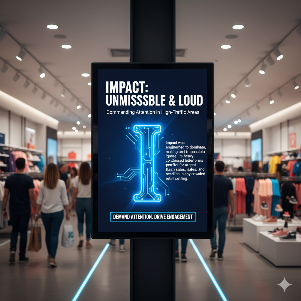
Impact was created to make text impossible to ignore, and that’s exactly why it’s one of the best fonts for digital signage in high-traffic areas. Its thick strokes and bold design guarantee that headlines or offers jump out at the viewer. This makes Impact perfect for advertising materials like digital billboards or mall signage.
Let’s say a cinema hall wants to promote a blockbuster movie on its digital signage displays, Impact is often the go-to because of its bold statement style. A good case is also seen in sports arenas, where digital screens use Impact to show scores or upcoming matches in a way that’s instantly visible.
9. Is Calibri a Clear Signage Font?
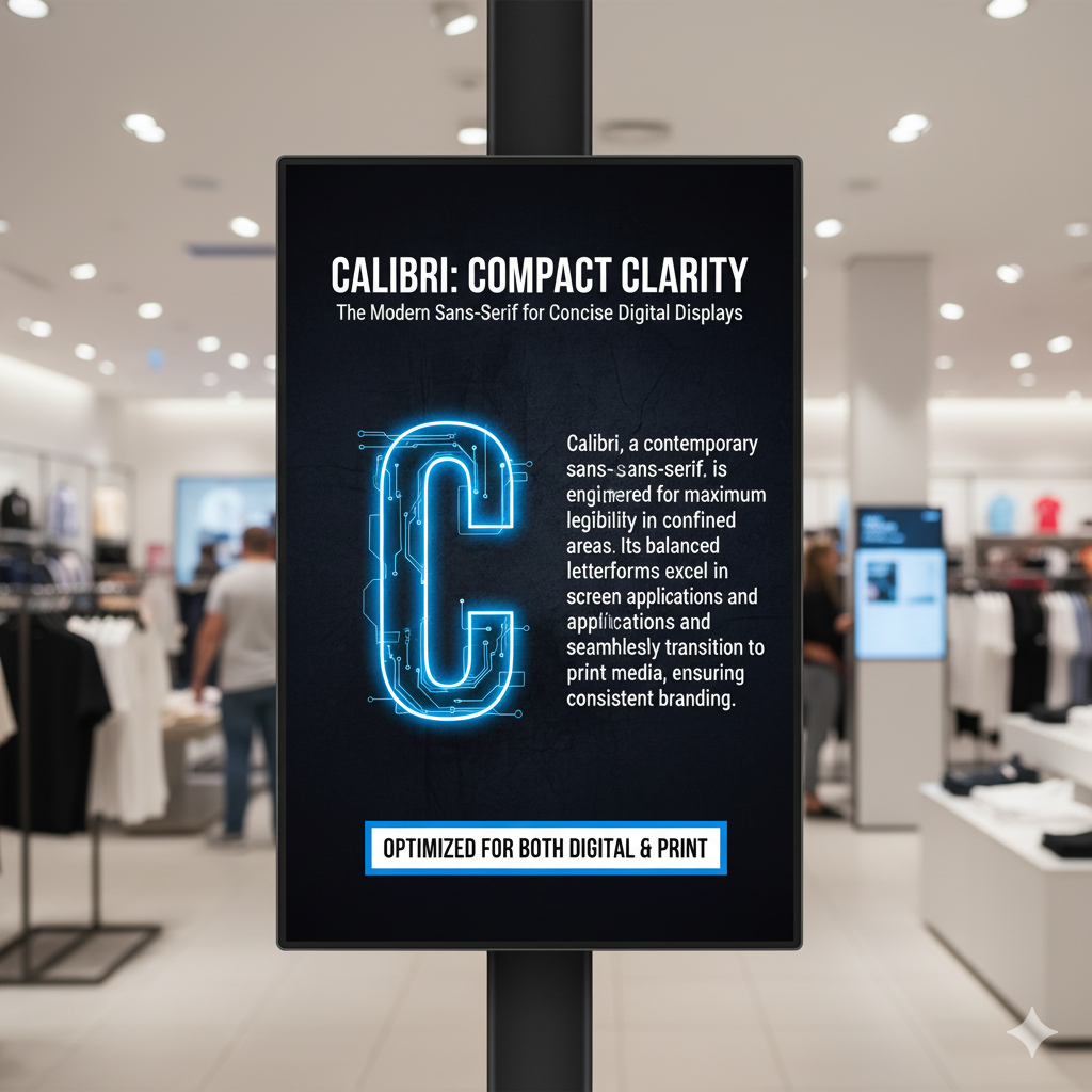
Calibri, a modern sans serif font, is designed for clarity in compact spaces and can also be effective in print materials. Unlike other fonts, it retains excellent legibility even at smaller sizes, which makes it a perfect font for digital signage content displayed on tablets, kiosks, or smaller in-store screens. Its rounded shapes and clean lines offer a modern aesthetic while remaining practical.
You’ve probably noticed Calibri in banks and financial institutions, where it’s used on digital queue management systems because of its readability in tight spaces. Let’s say a boutique store uses compact digital menu boards at the checkout. Calibri helps present promotions without cluttering the screen.
10. Is Raleway an Elegant Signage Font?
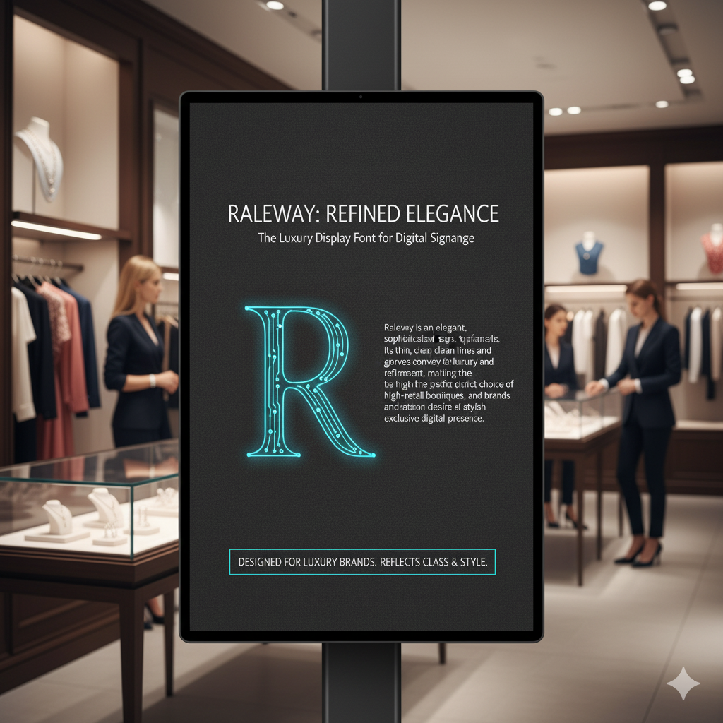
Raleway is an elegant display font known for its clean and stylish appearance. Its thin strokes and sophisticated curves make it an excellent choice for luxury brands that want their digital signage displays to reflect refinement. With its minimalistic style, Raleway instantly elevates the brand message and creates a modern aesthetic. According to Digital Signage Today, 8 in 10 shoppers said they entered a store because a digital display caught their attention.
Let’s take an example of a high-end jewelry store. Raleway often appears on digital advertising materials to promote collections, aligning perfectly with a luxury brand identity. Another good case is boutique hotels, where Raleway is used on digital lobby screens to share updates while maintaining a polished, premium feel.
11. Is Avenir Next a Signage Font?
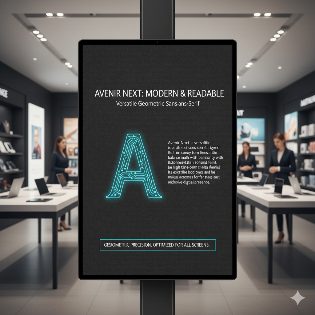
Avenir Next is a versatile geometric sans serif font that combines a modern look with excellent readability. Its balanced proportions make it adaptable for a wide range of digital signage projects, from menus to corporate displays. Brands looking for a perfect digital signage font that feels professional yet approachable often turn to Avenir Next.
Let’s say a modern café chain uses Avenir Next on digital menu boards; its clean lines ensure daily specials stand out clearly. You’ve probably noticed it in tech showrooms too, where digital displays highlight new product launches with a sleek and modern brand identity.
12. Is PT Sans a Signage Font?
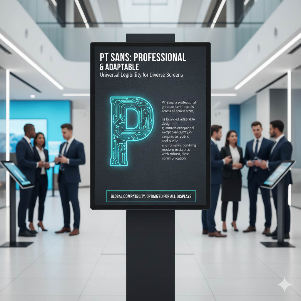
PT Sans is a professional-looking sans serif font that delivers excellent legibility across different screen sizes. Its adaptability makes it popular for diverse digital environments, from corporate offices to educational institutions. The font’s modern style ensures clarity without losing visual appeal.
Let’s take an example of a university campus, PT Sans is often used on digital wayfinding signage to guide students across buildings. Another good case is in retail banks, where digital signage screens use PT Sans for updates, promotions, and service information in a way that feels both clear and trustworthy. Getting the digital screen file resolution right keeps this text crisp on every display.
Why Choose AIScreen for Digital Signage Fonts?
Do you want to upgrade your screens with better fonts that truly capture attention? Choosing eye catching digital signage fonts is only the beginning of leveraging cutting edge technology. To get the most out of your displays, typography should be paired with well-structured layouts that highlight your brand message and improve digital signage effectiveness across every screen, and pairing them with digital signage analytics helps you measure what truly resonates. The right combination of font choice and design can completely transform the way your audience engages with your content. According to Forrester, digital signage leads to a 32% increase in repeat customers for retail brands.
AIScreen makes this process effortless by combining everything, fonts for your business, templates, layouts, and content into one easy-to-use platform. Whether you’re designing menus, promotions, or branded content, it ensures your digital signage projects are professional, consistent, and visually engaging. Start today and unlock your free trial with AIScreen digital signage software.


FAQs
Which fonts are most readable on digital signage screens?
The most highly readable fonts for digital signage screens are sans serif options such as Helvetica, Arial, and Roboto. Their clean lines and balanced proportions, along with distinct thick and thin strokes, make them easy to read even from a distance. These fonts provide excellent clarity across both small and large displays, which ties into font choice aesthetics . That’s why they are considered the perfect font choices for most digital signage projects.
How does font size affect digital signage readability?
Font size plays a critical role in digital signage effectiveness. Larger fonts with high contrast between thick and thin strokes remain highly legible in busy environments. Small fonts can get lost on big screens, especially in high-traffic areas. Choosing the right font size ensures your message stands out and maintains strong visual appeal.
What are the best fonts for digital signage in high-traffic areas?
The best fonts for digital signage in high-traffic areas include Impact, Bebas Neue, and Montserrat. These fonts deliver a bold appearance and grab attention quickly in crowded spaces. Their strong design ensures messages are noticed at a glance. For brands wanting a bold statement, these options work perfectly.
Are there any free fonts suitable for digital signage?
Yes, several free fonts are highly effective for digital signage displays. Popular Google Fonts like Open Sans, Roboto, and Raleway offer a modern style and strong readability, while also being complemented by serif fonts . These fonts combine clean lines with flexibility, making them perfect for professional signage projects. Businesses can use them at no cost without sacrificing quality.
How do I ensure font compatibility with digital signage software?
To ensure compatibility, stick with one or two fonts that your chosen digital signage software supports. This prevents layout issues and maintains a consistent brand identity. Platforms like AIScreen make the process seamless by managing font display across templates. This integration ensures that your digital signage content remains professional and reliable.
