
Which Creative Discount Sign Ideas Promote Sales?

Traditional discount signs can only do so much. Nowadays, digital signage increases sales by up to 30% compared to static signs. At AIScreen, our recent study found that businesses using real-time discount displays saw a 25% boost in impulse purchases.
Dynamic screens grab attention, update promotions instantly, and drive conversions like never before. Whether it’s limited-time offers, interactive QR codes, or AI-driven pricing, digital signage transforms how businesses promote sales.
Let’s explore creative ways to use digital signage to maximize rebates and increase revenue.
Creating urgency is key to driving impulse purchases. Digital markdown signs powered by digital signage software allow businesses to update prices instantly, making it easy to promote flash sales or daily deals.
How Do Digital Discount Signs Boost Sales?
Digital discount signs boost sales by making promotions, price reductions, and limited-time offers more visible to customers at the right moment. Bright displays, clear pricing, and quickly updated content can encourage impulse purchases and help businesses promote high-priority products more effectively.
1. Flash Sales & Limited-Time Offers

Creating urgency is key to driving impulse purchases. Digital markdown signs allow businesses to update prices instantly, making it easy to promote flash sales or daily deals.
Unlike static banners, digital displays can feature countdown timers, animations, and high-quality art to grab attention. Whether you run a retail store, restaurant, or service business, you can add urgency to promotions without needing to print new signage every time.
2. Interactive QR Code Discounts

Make it simple for buyers to access exclusive deals by displaying quality signs with scannable QR codes. These signs can send shoppers directly to checkout pages, loyalty programs, or special promotions. With a quick scan, they can order marked-down products, reducing friction in the buying process. A review of successful retail strategies shows that businesses using QR codes in their design strive for a seamless shopping experience, leading to higher conversions.
3. Personalized Discounts Based on Customer Data
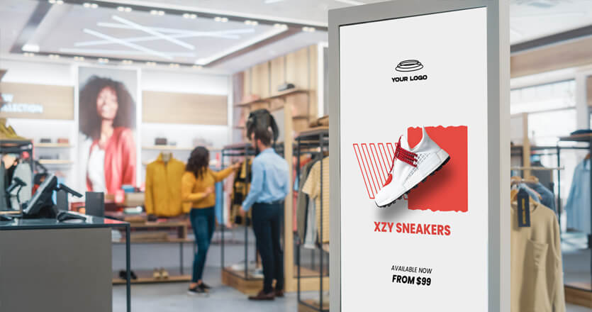
Using AI-driven signage, businesses can display absolute personalized discounts based on demographics, time of day, or shopping behavior. For example, a café can offer a morning coffee deal before 10 AM, while a clothing store can adjust value reductions based on foot traffic. This strategy ensures buyers always see the most relevant promotions, making them more likely to purchase.
4. AI-Powered Price Adjustments

Instead of manually updating signs, contractors and retail businesses can use digital displays to automate valuation. Whether you want to highlight heart-warming holiday promo or adjust frames of reference for seasonal promotions, AI-powered signs allow real-time updates. Businesses that strive for pricing flexibility see improved client engagement and increased sales.
5. Social Media-Integrated Promos

Encourage buyers to engage with your brand by displaying social media feeds on digital banners. You can even feature customer-generated content and offer exclusive rebates for those who tag your brand. A recent review of retail trends shows that businesses integrating social proof into their signage see higher customer trust and happy repeat shoppers.
What Makes a Discount Sign Effective?
- Prioritize Readability – Use high-contrast colors, bold fonts, and minimal text for clear messaging.
- Update Promotions Frequently – Keep content fresh with real-time adjustments based on inventory and events.
- Choose Strategic Placement – Position signage in high-traffic areas like entrances and checkout counters.
- Incorporate Motion & Interactive Elements – Use countdown timers, animations, and touchscreens to boost engagement.
- Test & Optimize – A/B test different layouts and messaging while tracking analytics to refine performance.
Following these practices ensures digital signage remains engaging, relevant, and effective in driving sales.
How Do You Design a Discount Sign?
Design a discount sign with goal defining. right display format, bold pricing, high-contrast colors, and short promotional wording that customers can understand at a glance. Keep the layout simple, highlight the discount amount or offer, and use clear branding so the promotion remains easy to recognize.

Step 1: Define Your Sign Goal
Before designing a sign, identify what you want to achieve. Are you promoting a limited-time offer, clearing inventory, or driving online purchases? Knowing the objective helps determine the best design, wording, and placement for your display.
Step 2: Choose the Right Display Format
Decide whether your discount will be shown on a banner, interactive touchscreen, video wall, or a smaller frame near high-traffic areas. Each format has its strengths:

- Large screens: Ideal for storefront windows or main aisles.
- Interactive displays: Great for engaging shoppers with QR codes or touch-based promotions.
- Counter displays: Perfect for impulse buys at checkout.
Step 3: Keep the Message Clear and Concise
A great discount sign uses minimal text while still conveying the deal effectively. Stick to absolute clarity by including:
- The percentage or amount of the discount
- The product or category on sale
- The order deadline or expiration date
- A simple call-to-action (e.g., “Buy Now” or “Scan for Offer”)
Step 4: Use High-Quality Visuals and Artwork

Eye-catching art makes a huge difference. Whether using product images, animations, or branded elements, ensure they are high-resolution and optimized for digital display. While protest signs rely on bold colors and impactful messaging to grab attention, digital displays take this further with motion graphics and interactive elements.
For businesses designing Canva signs, start with a simple layout that enhances readability before uploading it to your digital signage software for seamless integration.
Step 5: Pick Colors and Fonts That Stand Out
- Bright, high-contrast colors improve readability.
- Bold fonts help emphasize the key price or offer.
- Minimal clutter ensures the sign remains visually appealing.
Always review the final design on a screen to confirm that text and images are visible from a distance.
Step 6: Add Motion or Interactive Elements

Static images work, but movement grabs more attention. Consider:
- Short video loops showcasing the discount in action.
- Countdown timers to create urgency.
- QR codes leading to an online order page.
An engaging design encourages passersby to stop, look, and take action.
Step 7: Test and Optimize Your Signage
After launching your discount sign, analyze its performance. Digital signage software makes it easy to track engagement, foot traffic, and conversions. Review which messages perform best and adjust accordingly.
How Do Discount Signs Work Alongside Event Wayfinding?
Discount signs perform best when shoppers can actually find the products on offer. Pairing your markdown displays with directional signage for events guides visitors from the entrance straight to your promotional zone, so a well placed deal never gets missed in a busy venue.
Clear wayfinding can connect entrances, aisles, booths, and checkout areas with promotional displays, helping visitors move through the space without confusion. Directional arrows, zone labels, floor graphics, and digital screens can all point customers toward discounted products while reinforcing the same campaign message.
For larger events, consistent colors, icons, and wording make both discount signs and directional signage easier to recognize at a glance. This coordinated approach improves visibility, supports smoother foot traffic, and increases the chances that visitors will reach featured offers before leaving the venue.
How Can a Discount Sign and Eye Catching Business Signs Attract More Customers?
Discount sign and eye catching business signs work together to draw attention to promotions, special offers, and important brand messages. A strong discount sign should make the savings immediately visible, while eye-catching business signs use bold colors, clear typography, and strategic placement to stop people and encourage them to take a closer look.
Businesses can improve results by keeping promotional wording short, highlighting the discount amount, and using consistent branding across all displays. Combining a clear discount sign with eye catching business signs can help increase visibility, support impulse purchases, and make storefront promotions easier for customers to notice and understand.
Why Choose AIScreen for Discount Signs?
AIScreen and discount signs help businesses promote sales, special offers, and limited-time deals with clear, attention-grabbing digital displays. Dynamic updates make it easy to change prices, highlight featured products, and keep promotions fresh.
With AIScreen, businesses can manage discount signs remotely and keep messaging consistent across multiple screens or locations. Try AIScreen free for 14 days and create smarter promotional displays that support stronger customer engagement.


