
How to Optimize Digital Signage Images for Maximum Clarity
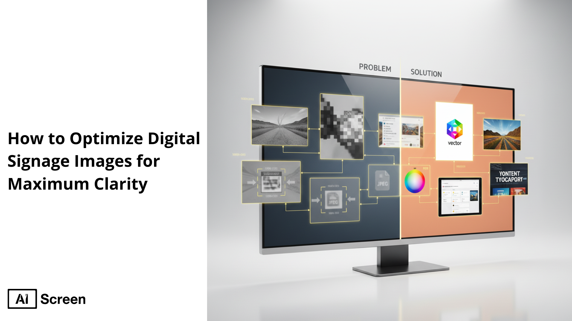
To optimize digital signage images for maximum clarity, focus on high resolution, proper sizing, strong contrast, and clear design. Make sure your images are the exact resolution that fits your digital signage displays, favor high-contrast combinations between text and background, and use bold, easy-to-read fonts with uncluttered layouts. This is truly the best practice for creating visually appealing and effective digital signage content. According to MarketsandMarkets, the digital signage market is set to grow by over $11 billion between 2025 and 2029, driven by demand for high-quality, visually compelling digital content among retailers and venues.
In this blog, you’ll explore common causes of blurry imagery and learn 10 proven solutions to ensure your visuals stay crisp and clear across digital screens. From selecting the right file formats to mastering visual hierarchy, this guide helps you design compelling digital signage displays that maintain clarity and engage audiences across multiple displays.
Why Image Clarity Matters in Digital Signage
Image clarity matters in digital signage because when the content is sharp and easy to read, even from a distance or at a glance, your digital signage software shines and stands out. Blurry or pixelated visuals can easily decrease the credibility, reduce readability, and damage the viewer’s perception of your brand.
According to Fortune Business Insights as the digital signage market is expected to reach $35.94 billion by 2029. Digital signage content that’s unclear risks losing attention, diluting communication, and undermining trust.
Here are some key points that need to be considered:
- First impressions impact engagement and trust: A viewer’s first reaction is formed within seconds. Crisp visuals create immediate trust and capture the audience’s attention. For instance, clear digital posters or digital menus deliver key information quickly, whether it’s a price, event update, or brand message, strengthening viewer interest and brand identity.
- Clear images boost readability and brand perception: Sharp images improve legibility, especially in high-traffic areas or bright environments. Good visual hierarchy, like using large fonts, ample white space, and consistent branding elements, guides the eye and reinforces your message effectively. Consistent visual elements across displays help maintain viewer engagement.
- Blurry visuals reduce effectiveness and lead to visual clutter: Blurry content becomes distracting, cluttering the viewer’s experience. Low-resolution graphics, poor contrast, or incorrect aspect ratios (like stretching a small image to fit a large screen) can make messages unreadable. Following proper digital signage content design, using high-quality visuals, matching screen resolution, and keeping text concise (ideally under five words per line), preserves clarity and delivers impactful communication.
What Causes Blurry or Pixelated Digital Signage Images?
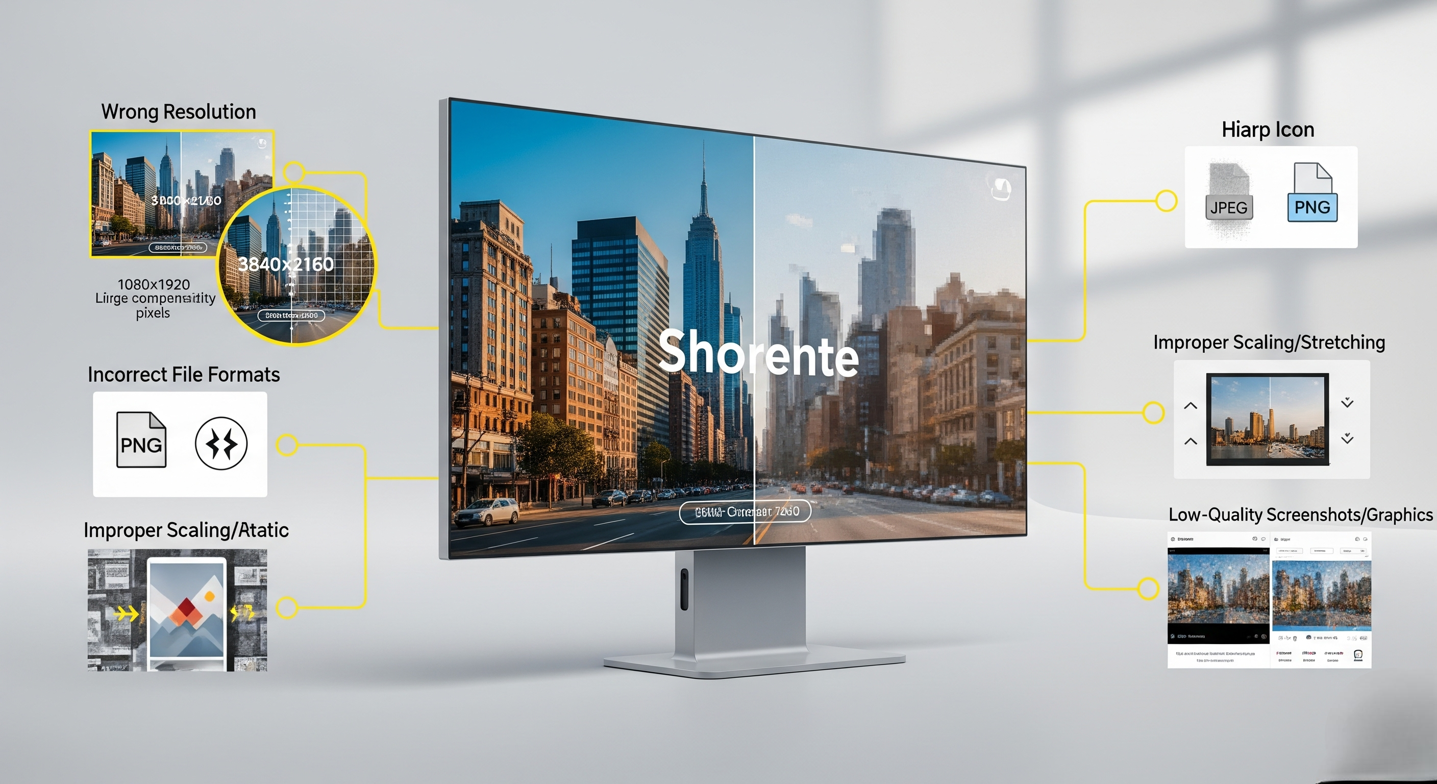
Issues that cause blurry or pixelated digital signage images often boil down to file mismatches, poor preparation, or scaling errors. These problems are surprisingly common, especially when content is repurposed without adjustment for digital displays, and can lead to fuzzy visuals, misaligned text, or distorted brand elements.
Here are the top culprits:
- Wrong resolution for screen size: If your image’s resolution is lower than the screen’s native resolution, it appears fuzzy. For example, stretching a 1080 × 1920 image to fit a 4K screen (3840 × 2160) results in noticeable blurring. Always match your file resolution to the display’s native resolution to preserve clarity.
- Incorrect image file formats: Using compressed JPEGs or BMP files without proper optimization can blur text or graphics. Instead, use high-quality PNG or high-bitrate JPGs tailored for high-contrast signage, for sharper visual elements like logos and key messages.
- Over-compressed image assets: Compression artifacts, like blockiness around edges, make signage look messy. Avoid over-saving images with high compression. Instead, aim for a balance between file size and quality by keeping key assets lossless or minimally compressed.
- Improper scaling or stretching: Photoshop-style stretching distorts aspect ratios, making people or products look warped. Maintain the correct aspect ratio, or use content-aware scaling tools in digital signage software that auto-fit the content without distortion.
- Low-quality original graphics or screenshots: Using blurry screenshots or low-res web graphics, especially with visual elements like social media feeds or static content pulled from apps, leads to fuzzy signage. Always source high-resolution original files or design content specifically for the signage purpose.


10 Proven Solutions to Optimize Digital Signage Images for Maximum Clarity
To make your digital signage content stand out, you need to keep images sharp, properly sized, and visually appealing across all digital signage displays. Clarity directly affects audience engagement, brand trust, and how well your key messages are understood. Sharp visuals also help advanced tools like face recognition digital signage software tailor content accurately to each viewer. The following best practices will help you avoid visual clutter, maintain visual consistency, and deliver effective digital signage content that captures attention in high-traffic areas.
According to Statista (2023), over 83% of consumers recall content from digital screens within 30 seconds of exposure, showing that clarity and presentation are crucial for delivering compelling content and keeping viewer interest strong.
1. Use High-Resolution Images (At Least 1080p or Higher)
Use high-resolution images to avoid blurriness and pixelation. As a rule of thumb, 1080p (1920×1080 pixels) should be your baseline for most digital signs, while 4K (3840×2160 pixels) is ideal for larger screen sizes and advanced technology displays.
For multiple displays or video walls, higher resolutions like 8K (7680×4320) ensure sharpness at closer viewing distances. When you create content, always start with the highest-quality assets possible, because scaling down preserves clarity, but scaling up ruins it. Sharp images make digital posters and displays like a digital hall of fame visually appealing and ensure your target audience receives clear information.
2. Match the Image Resolution to Screen Resolution
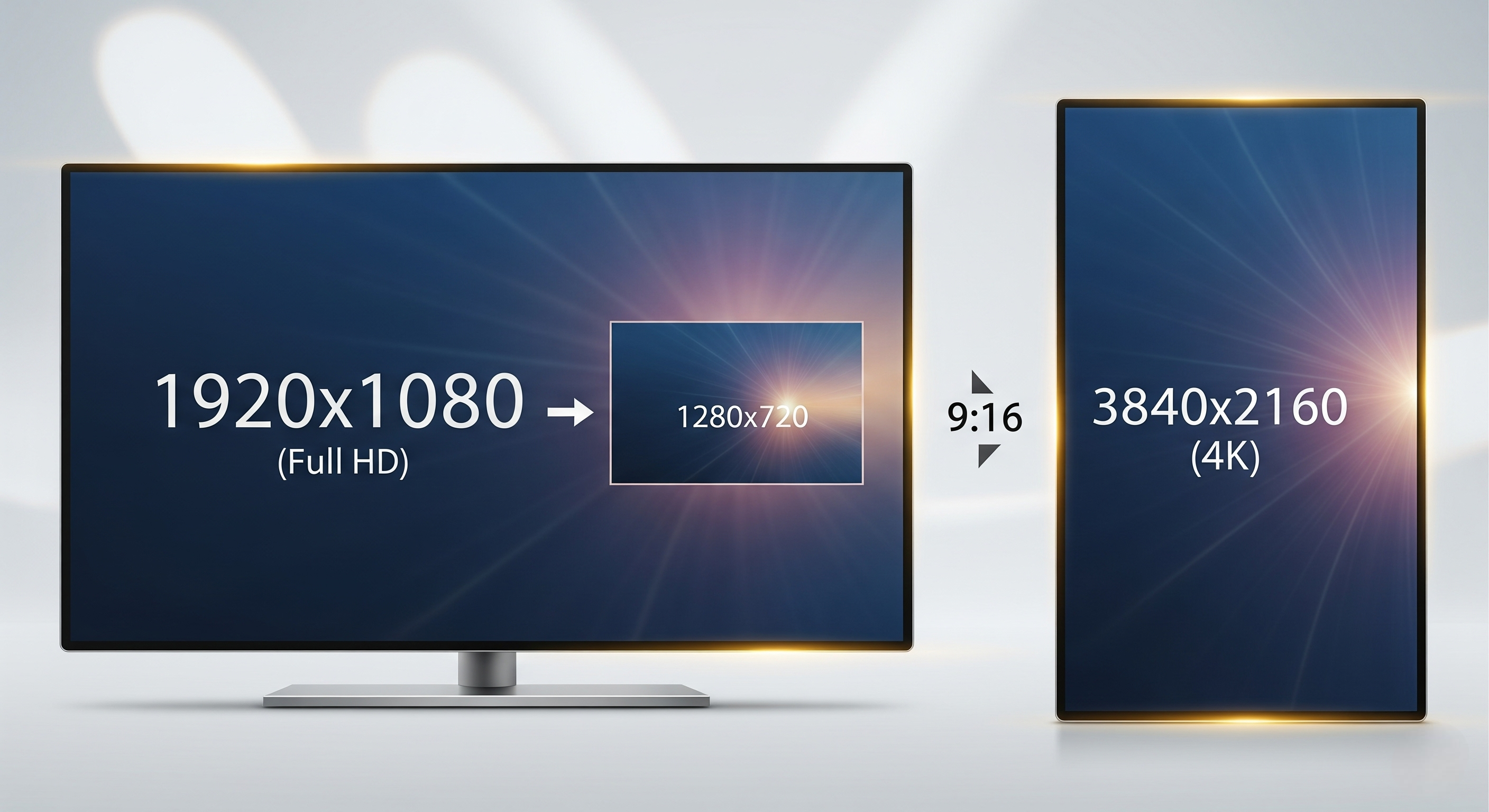
Match the image resolution to screen resolution to prevent distortion. If your display has a native resolution of 1920×1080, your images must be exported at exactly that size. A mismatch, such as uploading a 1280×720 image to a 1080p screen, creates fuzzy edges and reduces visual appeal.
For 4K digital signage displays, always work at 3840×2160. The same goes for aspect ratios: a 16:9 screen requires 16:9 content, while vertical digital signage stands often need 9:16 layouts. Following this ensures visual consistency and keeps your key information easily readable for all viewers.
3. Compress Images Without Losing Quality
Compress images without losing quality to balance speed and clarity. Compression reduces the MB size of an image, making it quicker for media players and remote management systems to load, critical for dynamic content like social media feeds or rotating menus.
Use formats like SVG for icons or AI files for logos, since they scale infinitely without losing sharpness. Plenty of free and paid apps, like TinyPNG, Squoosh, or ImageOptim, help shrink files while keeping details intact. This is one of the most practical tips for optimizing content while maintaining an engaging viewer experience.
4. Save Images in Recommended File Formats

Save images in recommended file formats to protect clarity. PNG files work best for graphics, text overlays, and branding elements, while JPEGs suit detailed photos with gradients. For logos or icons, SVG keeps edges crisp on all screen sizes.
Tools like TinyPNG, ImageOptim, or Squoosh compress files while retaining sharpness. By choosing the right format, you avoid pixelation, maintain clear visual hierarchy, and keep lines of text easily readable. The right format ensures quality content that delivers effective communication and enhances your digital communication strategy.
5. Avoid Stretching or Auto-Fitting Images
Avoid stretching or auto-fitting images, since this distorts proportions and undermines aesthetic appeal. Instead, crop or resize your visuals before uploading. For example, if your digital signage stand is 1080×1920 pixels, design your asset exactly to that ratio.
PNG ensures sharp edges for text and graphics, while JPEG is better for high-quality photos. When designing digital signage content, always preserve the original aspect ratio, forcing images to stretch creates visual clutter and distracts from your particular message.
6. Disable auto-scaling in CMS and manually size the image beforehand
Disable auto-scaling in CMS and manually size the image beforehand for the cleanest results. Most digital signage software has an auto-fit function that stretches or compresses content, but that often compromises clarity. According to SignageList data, there are 20.16 million+ digital signage screens globally managed by 515+ software products in 2025.
Instead, export your graphics in the correct screen sizes and upload them directly. This preserves visual elements, prevents lines of text from breaking awkwardly, and ensures your digital content always looks sharp. Following this best practice ensures effective digital signage that communicates key messages without overwhelming viewers.
7. Choose Bold Fonts and High Contrast Overlays
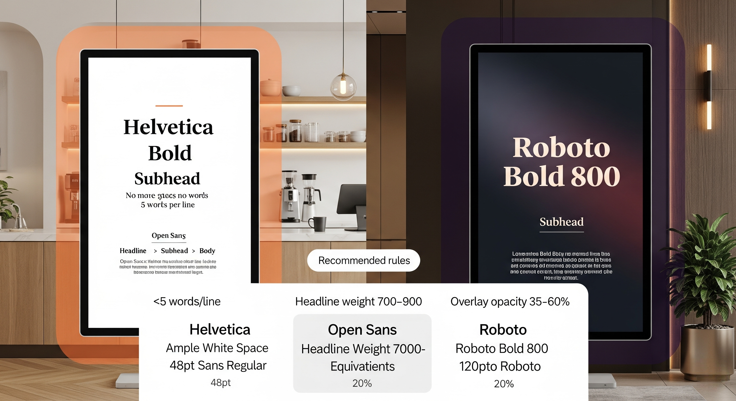
Choose bold fonts and high contrast overlays to keep your key information readable, even at a distance. Professional sans serif fonts like Helvetica, Open Sans, or Roboto work best because they remain clear on large screens.
Use light backgrounds with dark fonts in cafés for a clean, modern feel, or dark backgrounds with bright text for corporate offices. Keep lines of text short, no more than five words per line, and add white space for balance. These branding elements create a visually appealing style that maintains viewer interest and enhances user engagement.
8. Preview on Real Display Before Publishing
Preview on real display before publishing to ensure your digital signage content design looks great in real-world conditions. What looks sharp on a laptop may appear blurry on a large digital sign due to scaling or lighting differences.
By testing on the actual display, you can fine-tune content strategy, adjust visual elements, and ensure your message is easily readable in high-traffic areas. This step also helps maintain visual consistency across multiple displays and ensures your target audience receives detailed information without distractions.
9. Stick to RGB Color Mode, Not CMYK
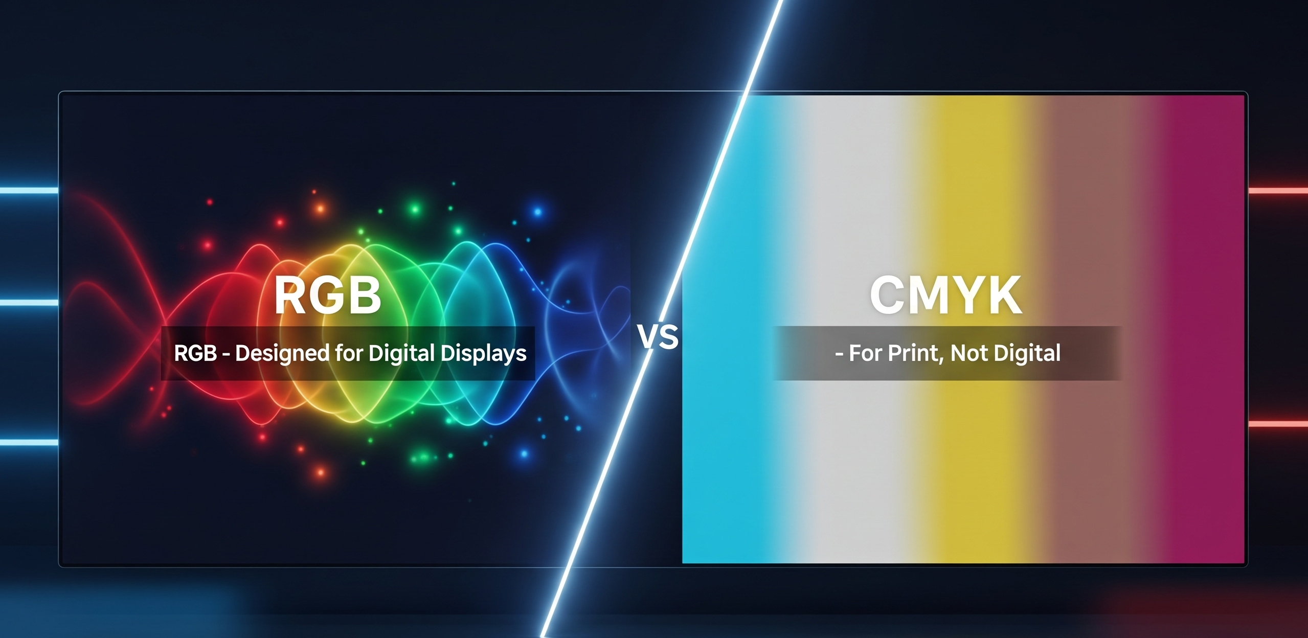
Stick to RGB color mode, not CMYK because digital displays rely on red, green, and blue light, not print inks. Designing in CMYK leads to dull colors when shown on digital screens. Always set your design files to RGB for vibrant, visually appealing results.
RGB also ensures interactive content and interactive features, like animations or video backgrounds, display correctly. Sticking to RGB is one of the simplest best practices to maintain high quality visuals and keep your digital communication sharp and effective.
10. Use Image Editing Software to Sharpen and Enhance
Use image editing software to sharpen and enhance your visuals. Tools like Canva’s photo enhancer, Adobe Lightroom’s clarity slider, or AIScreen Canvas can dramatically improve sharpness and vibrancy. Sharpening emphasizes key elements like logos or text, making them easier to read from a distance.
If you’re looking for a simple way to design and display content without advanced tools, check out our guide on how to use PowerPoint for digital signage. It covers step-by-step tips to turn your slides into effective digital signage content that captures attention and delivers messages concise and clear. The same clarity principles apply when you design a digital signage ad that needs to convert at a glance.
Optimize Your Digital Signage Design with AIScreen’s Image Management Tools!
Optimize your digital signage design with AIScreen’s image management tools. With features like drag-and-drop editing, automated resolution matching, and real-time display previews, AIScreen simplifies the process of designing digital signage content.
Whether you’re adding interactive elements or creating dynamic content, the platform ensures your digital signage content strategy follows best practices for effective communication. This allows businesses to create content that blends high-quality visuals with body text, delivering the best digital signage content to engage audiences in real time.
FAQs
What is the ideal image resolution for digital signage?
The ideal image resolution for digital signage depends on the screen size and type of dynamic content you are displaying. For 1080p screens, images should be at least 1920×1080 pixels, while 4K displays require 3840×2160 pixels for clarity. Following best practices when designing digital signage content ensures sharp visuals and effective communication with your audience.
Can I use Canva or Photoshop to optimize signage images?
Yes, you can use Canva or Photoshop to optimize signage images because both tools allow you to create content with precision. Canva provides quick templates and drag-and-drop ease, while Photoshop offers advanced control for interactive elements and body text. Using these tools with a clear content strategy will help produce the best digital signage content.
What happens if I upload a low-res image to a 4K screen?
If you upload a low-res image to a 4K screen, the content will appear blurry and pixelated, which reduces audience engagement. Designing digital signage content with proper resolution ensures dynamic content looks professional and aligned with best practices. To create content that truly enhances effective communication, always match resolution with screen capability.
Should I use PNG or JPEG for signage?
Yes, but you should use PNG or JPEG for signage, depending on the type of content you want to create. PNG is ideal for crisp logos, graphics, and interactive elements with transparency, while JPEG works best for large photos and body text backgrounds. Following a few tips from content strategy experts can help you choose the format that delivers the best digital signage content.
How can I reduce file size without lowering image clarity?
You can reduce file size without lowering image clarity by compressing images using design tools while preserving resolution. This is especially important when creating dynamic content and designing digital signage content that loads quickly. Applying best practices and a thoughtful content strategy ensures your signage delivers effective communication without sacrificing quality.
