Table of Contents
1. Logo Proportions and Size
manager.aiscreen.io/whitelabel
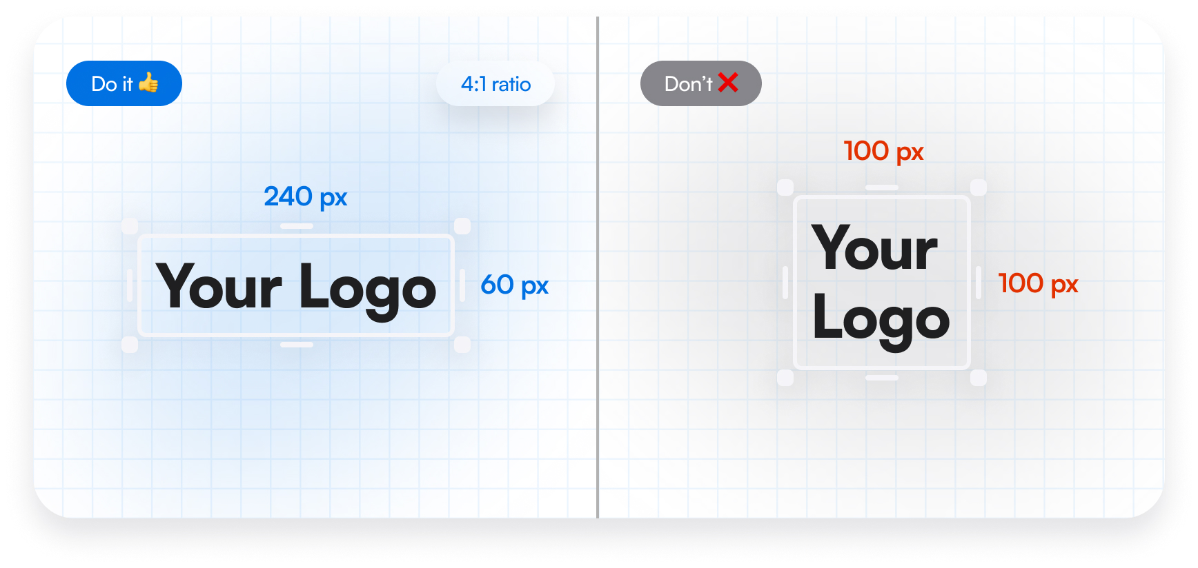
- It is recommended to use the logo in a 4:1 ratio. When scaling, this proportion should always be maintained to ensure the logo appears correctly, remains recognizable, and is not visually distorted within the interface.
- The minimum recommended logo size is 240 × 60 px. This size ensures better readability, visual clarity, and stable logo display across the interface. The logo may be used at larger sizes when needed, but the 4:1 ratio should always be preserved.
2. Preferred Logo Style
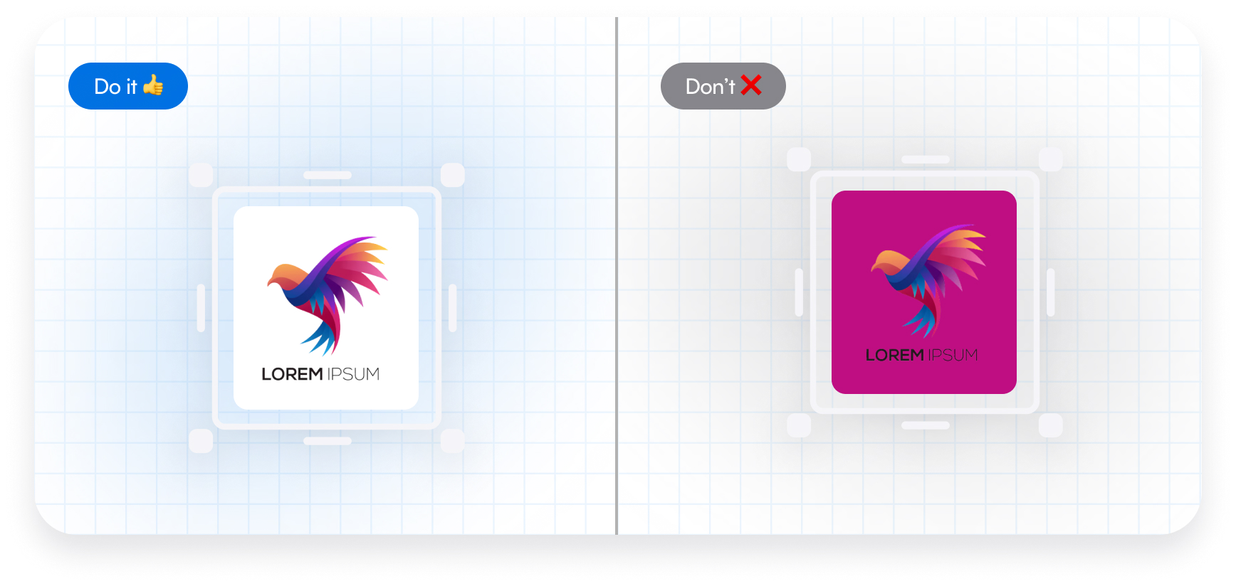
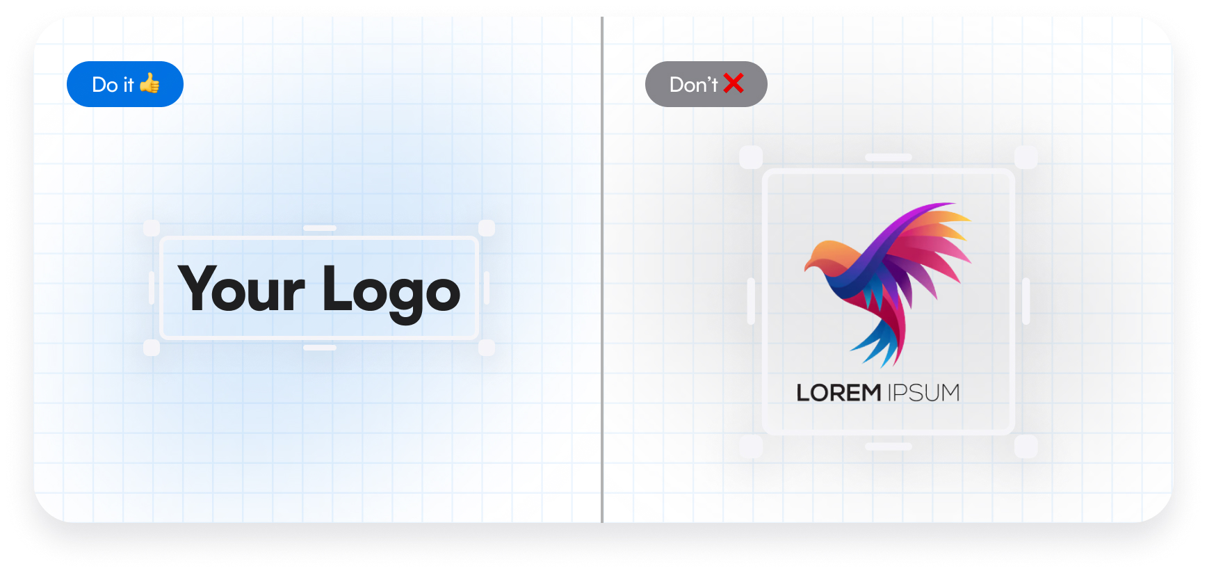
- Monochrome logos are the preferred option for white-label placement. The most universal and recommended solution is a black logo on a white background, as this provides maximum contrast, a clean appearance, and easy integration into most interfaces.
- Preference should be given to simple, high-contrast logo versions without unnecessary color elements. A monochrome approach helps maintain visual consistency and avoids conflicts with the color palette of the white-label environment.
3. Background Usage
- If the logo is used with a background, it is recommended to apply rounded corners to the image. This helps create a cleaner, more modern appearance and improves visual compatibility with most interface designs.
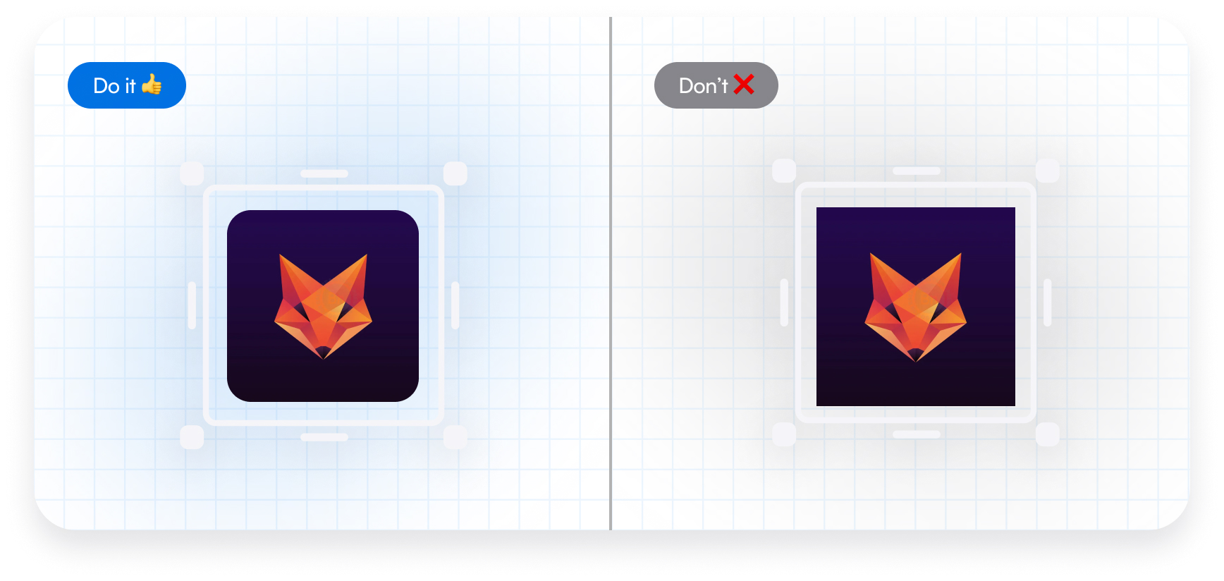
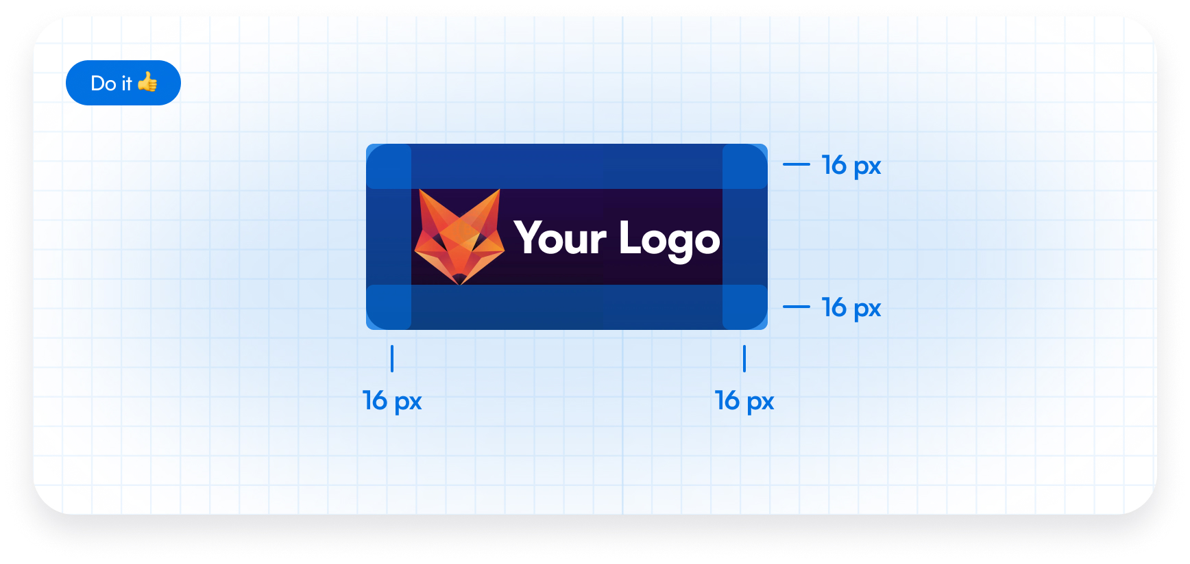
- If a logo version with a background is used, a minimum padding of 16 px should be maintained on all sides. This ensures the logo remains visually balanced, does not appear cramped, and preserves clear separation from surrounding interface elements.
4. Final Review Before Placement
- Before final placement, the logo should be tested on different background types. It should remain clear, high-contrast, and easy to read across different usage scenarios.